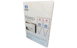
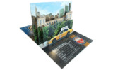
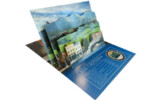
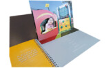
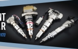
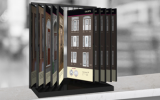
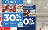
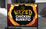
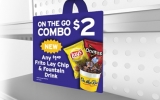
Retail Header Graphics
Custom Header Graphics – Captivating Signage for Maximum Visibility
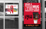
Hopkins Printing specializes in high-quality header graphics designed to enhance retail displays, capture customer attention, and drive sales. Positioned at eye level or above, header graphics serve as bold, eye-catching marquee signage that draws customers into your store or display area.
What Are Header Graphics?
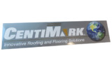
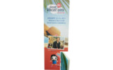
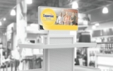
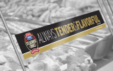
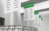
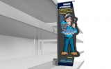
Header graphics are large, visually striking displays mounted on top of shelves, case stacks, or fixtures. They are detailed and designed to stand out, making them ideal for highlighting promotions, top products, or store sections.
Effective Uses for Header Graphics:
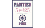
- Promoting Sales: Highlight bargain sections to move inventory quickly and efficiently.
- Showcasing Top Products: Draw attention to best-selling or premium items with headers positioned for maximum visibility.
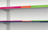
- Segmenting Products: Organize store sections for easy navigation, ensuring customers find items without frustration.
- Highlighting Specialty Items: Advertise age-restricted or niche products stored in secure areas to maintain compliance while promoting sales.
Why Header Quality Matters
A successful header graphic is concise, visually appealing, and crafted from durable materials suited to its purpose. Hopkins Printing recommends:
- Long-Term Use: Acrylic, expanded PVC (Komatex, Sintra), or polystyrene (HIPS) for durability and resistance to damage.
- Short-Term Use: Foamboard, cardstock, or cardboard for temporary promotions lasting 1–3 weeks.
Poor-quality headers with excessive text or flimsy materials can deter customers. High-quality, concise graphics create an enticing and professional aesthetic that enhances the shopping experience.
Materials Commonly Used for Header Graphics:
- Foamboard
- Polystyrene (HIPS)
- Acrylic
- PETG
- Cardstock
- Expanded PVC (Komatex, Sintra)
Partner with Hopkins Printing
Elevate your retail displays with custom header graphics that combine bold design, quality materials, and flawless execution. Contact Hopkins Printing today to discuss your project and discover how we bring your vision to life. From durable long-term signage to cost-effective short-term options, we’re here to help your business stand out.
Constructed most commonly using: Foamboard, Polystyrene (HIPS), Acyrlic, PETG, Cardstock, or Expanded PVC (Komatex, Sintra, etc.)
Headers are also known as: Topper panel, Header graphic, Marquee, Riser sign

